Gigaclear UX
Overview


Background
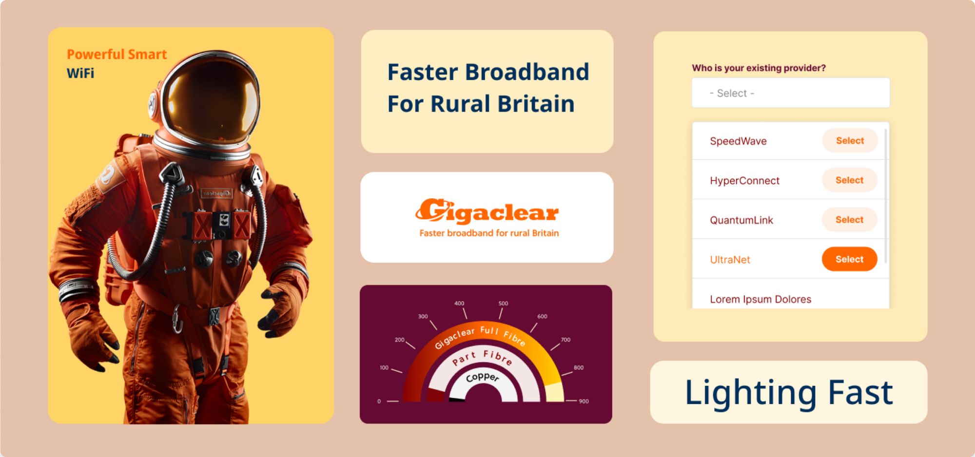
Apart from tele-sales, GigaClear sells its broadband packages through a comprehensive website designed with basic brand guidelines. This platform serves as the primary sales channel, where customers can explore different broadband packages, understand their features, and proceed to make a purchase. However, as the company grew, the limitations of the initial website usability became apparent, impacting both the website’s consistency and the overall customer experience.
The challenge
Despite GigaClear’s high-value ultra-fast broadband offerings, their website faced multiple hurdles. Although built using basic brand guidelines, the website did fall short on offering a seamless customer experience due to inconsistent usability practices and design. These inconsistencies created bottlenecks which needed to be addressed.
Design Audit and Identification of Needs
Careful planning of the design system
We are strategists, designers and developers. Innovators and problem solvers. Small enough to be simple, quick and creative.
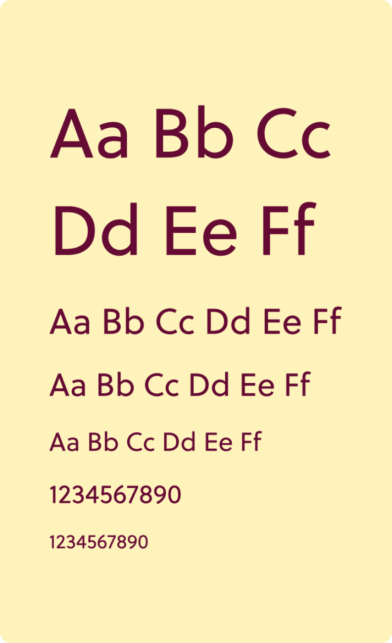
Typography & Colour Selection

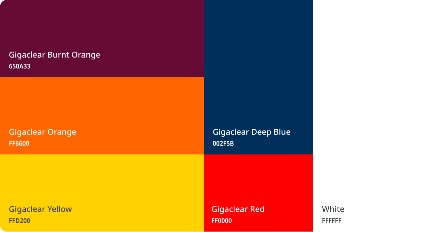
Colour Palette
We translated GigaClear’s brand identity to capture their warm and energetic brand colours to develop a vivid yet non-offensive colour palette as well as extended and grayscale palettes to cover all the required colors for the product’s interface.
Custom Illustrations for Common Usage



Tools That We Used


Tools That We Used



Conclusion
GigaClear’s transformation is a perfect example of how businesses—whether they are in the broadband sector or any other—can benefit from a thorough design audit and a strong, well-planned UX strategy. Whether you’re in e-commerce, finance, or SaaS, a consistent, user-friendly experience can transform how your customers interact with your digital platforms.
We specialize in delivering customized UX solutions that not only solve immediate challenges but also set your business up for long-term digital success. If you're facing similar hurdles or looking to elevate your customer experience, reach out to us today to discover how our team can help you achieve your goals.
let’s talk
© 2025 Yuex Inc. All rights reserved.


