CareCompass by Mable
Let’s Talk

Overview

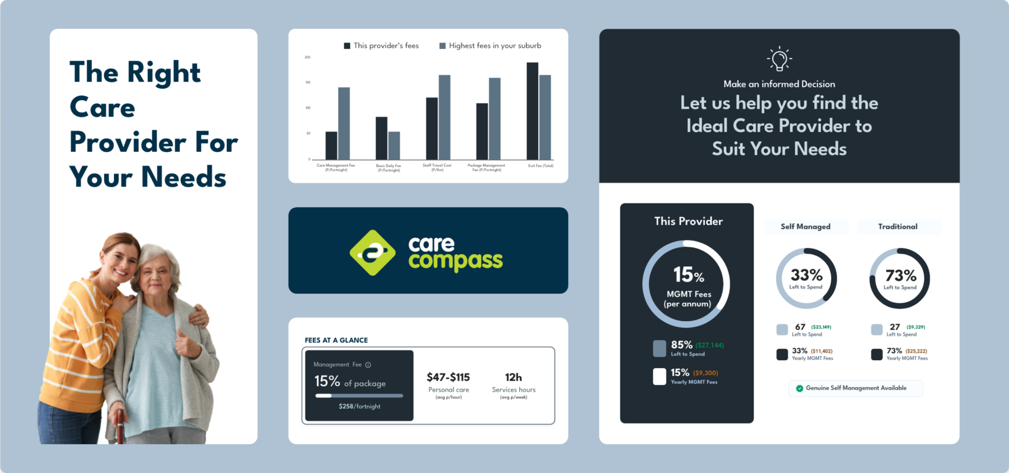
CareCompass is the brain child of Mable which is a website that connects people looking for disability or aged care support with support workers. CareCompass builds on this principle by streamlining the aged care provider package discovery phase and simultaneously educating users on the benefits of using self-managed aged care services.

Product design
UX testing
Brand development
Front-end development
Craft CMS development
Copywriting
Graphic design

Background

Aged care services tend to be quite expensive in Australia and it is quite tough and time-consuming to get approval for aged care grants for disabled and senior citizens. It is vital to make the best out of the yearly aged care allowance. Due to lack of awareness most citizens opt for services from traditional aged care providers when in reality most citizens have the potential to manage adequately with a self-managed service package and get far more care out of their annual allowance.

The challenge

The main challenge of CareCompare was coming up with a viable MVP that was both usable enough to find the ideal aged care service package, and educates it’s main target demographic (senior and disabled citizens) about the benefits of using self-managed aged care services.

Figuring Out the User Journey
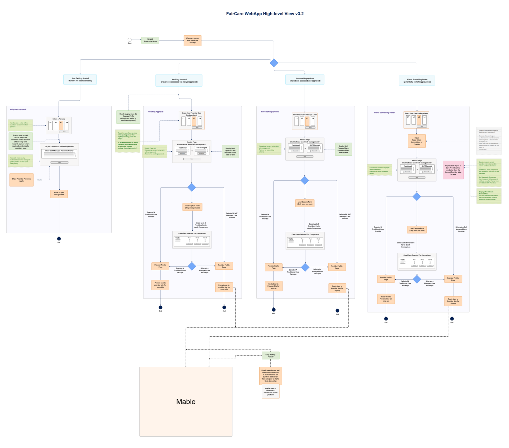
Sketching out the user journey for this MVP proved to be challenging since we were trying to convince users throughout their journey about the benefits of self-managed aged care services.

We managed to get a breakthrough in routing users to relevant parts of the overall journey in applying for a aged-care service package by identifying in which stage of their aged care grant application/usage process they were in. This made it easier to direct users to the relevant information they were looking for that would be the most helpful to them at their current stage.

Finding a Layout That Works

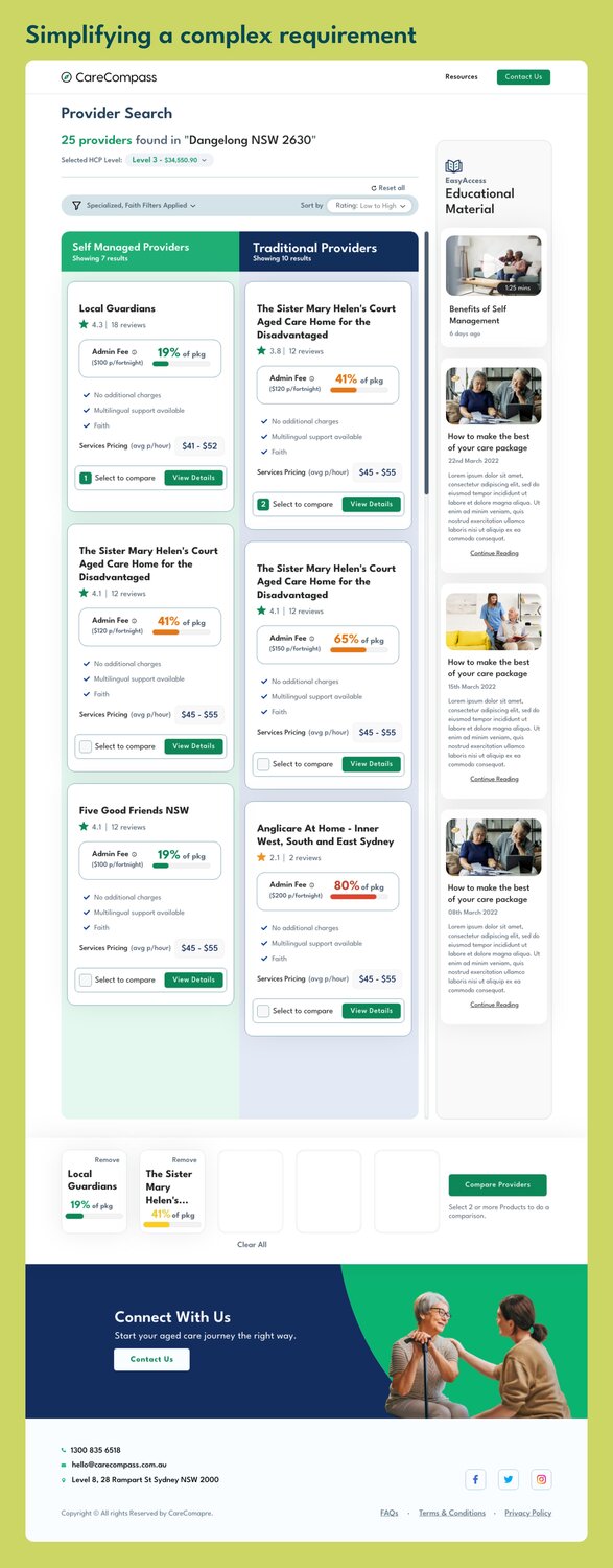
After many a trial and error we finally settled on a 3 column layout for the product search results page. The 2 main column layouts are for traditional aged care packages and self managed age care packages respectively.

The goal is to highlight the noticeable price differences between the 2 types of service packages through the usage of colour coded markers for how much of the users annual aged care budget will be used by each service package.

Comparison Widget

Users can select up-to 5 service packages and compare them using the comparison widget that appears and hovers at the bottom of their display.

Educating Users

The 3rd column is dedicated to route users to useful information on what is self managed aged care service packages and how we can get the best use out of it.

Shown below is the screenshot of the results page. Note that this was our initial place-holder colour theme before the branding was finalised by the client.
Typography & Colour Selection
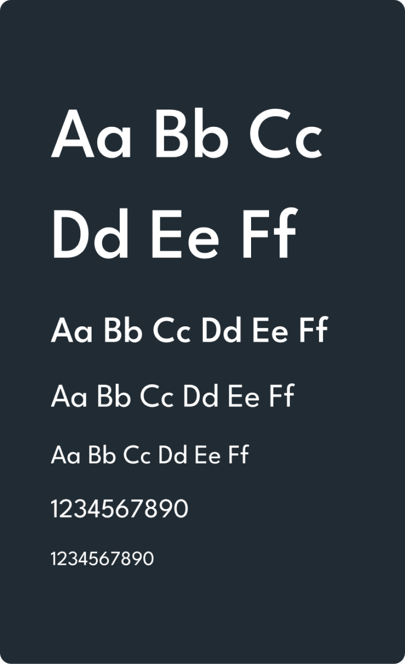
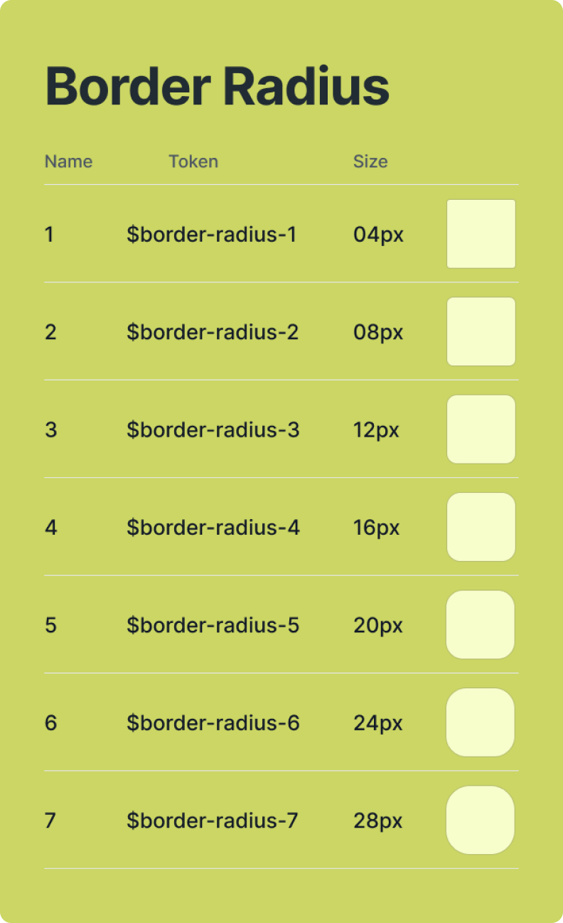
We chose League Spartan as the primary brand font to reflect a bold, modern, and impactful aesthetic while maintaining a sense of simplicity and clarity. Its geometric structure and thick strokes create a striking visual identity, making it perfect for key headlines and focal points across the site.

Despite its bold nature, League Spartan remains highly legible on all devices, adding both strength and sophistication to the brand’s web presence.

Colour Palette

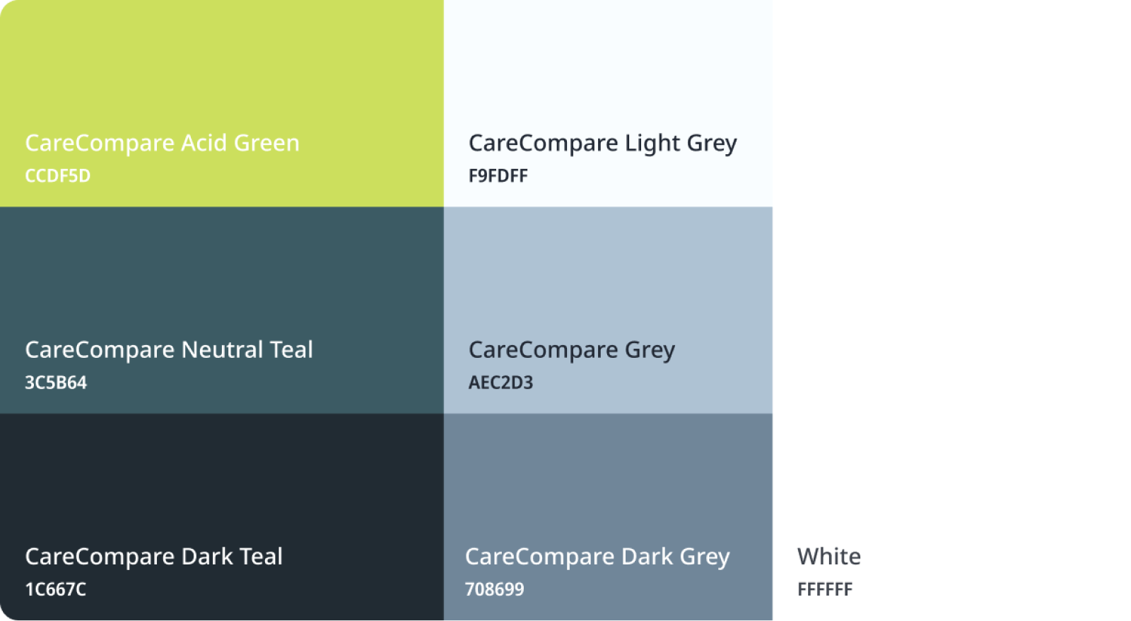
For the colour palette, we opted for slate black as the primary colour while acid green and neutral teal served as accent colors. Light shades of grey are used sparingly to add depth and subtlety, while the generous white space evokes a clean, modern, and open feel, ensuring that the design remains minimal and approachable. This combination provides a sleek, professional look that allows key content to stand out. Especially since the website is heavy on written content.
Added Focus on Accessibility

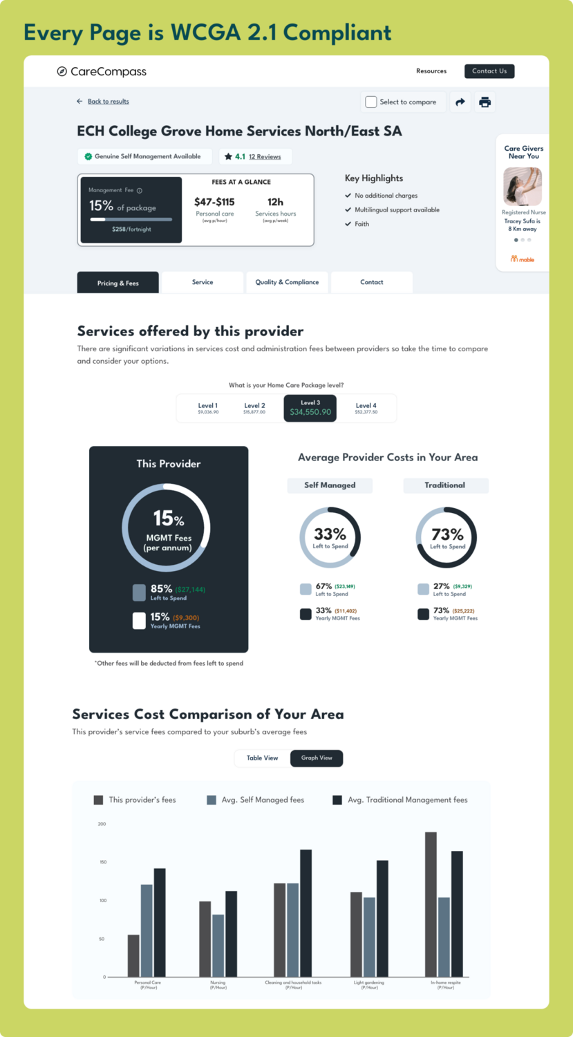
We paid particular attention to the accessibility standards for this MVP because most of it’s user base will have declining vision. Maintaining proper contrast throughout our content which meets WCAG 2.1 guidelines.
Tools That We Used

These are some tools that helped us bring this product to reality

Conclusion

CareCompass serves as a prime example of how businesses can effectively bridge the gap between complex service offerings and customer education. Much like companies across various sectors, CareCompass needed to simplify its product, educate users on its value, and guide them through an unfamiliar journey. By focusing on clear comparisons, a user-friendly design, and maintaining accessibility, we ensured that the platform could meet the diverse needs of its target audience.

let’s talk

privacy policy

cookie policy

© 2024 Yuex Inc. All rights reserved.
An
itelasoft
company.
© 2024 Yuex Inc. All rights reserved.
Privacy PolicyCookie Policy
© 2024 Yuex Inc. All rights reserved.